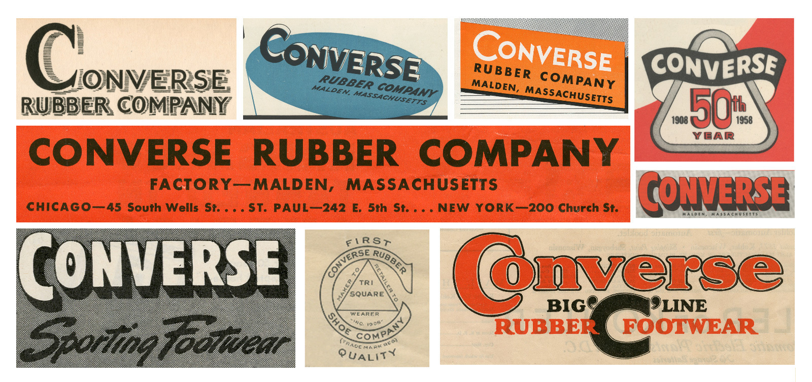
With a company as old as Converse, a whole bunch of different logo’s would have been seen over the years as in the image below. As a company who grows over time, a fresh logo design could keep you up to date in the market and show your goals and ideals a bit more clearly.
Logo’s can be a form of identity as a company. Think of a red can and Coca-Cola comes to mind. Or a white apple and Apple comes to mind. Converse is trying to incorporate the fact that their logo will be recognised anywhere without their name being on it and they’re succeeding. This new, fresh and modern logo that represents their heritage as well as the fact that they’re moving forward.
Converse’s Vice President of Global Brand Design Adam Cohn, when asked where he would be most excited to see the new logo, stated: “For me, the satisfaction won’t be in one location, but when people think of this logo as our brand over things like the Chuck [Taylor] logo.”
![]()
Replacing the star in the “O” of the name, by combining the star chevron with a refreshed wordmark. Representing brand heritage, this is a gorgeous and modern new logo identity. Researching previous Converse logos, the team tried to find something that would go well with the star chevron and they did – combining heritage with something new.

[via Cool Hunting, images via various sources]